Designing Financial Dashboards for the Web | Webflow UX Guide
February 7, 2026
Enterprise-Level Security
FinTech platforms handle sensitive customer and financial data, which makes security non-negotiable. Webflow sites are hosted on AWS with ISO 27001 compliance, SSL built-in, and enterprise-grade DDoS protection. This means your website benefits from the same infrastructure trusted by the world’s most secure organisations.
Fully Customisable Experiences
Every FinTech brand is unique – from challenger banks to payment processors. Webflow allows complete design flexibility without reliance on rigid templates or plugins. With bespoke CMS structures and custom code, we deliver scalable sites tailored precisely to your products, users, and regulatory requirements.
Lightning-Fast Performance
In financial services, speed translates directly to trust. Webflow’s global CDN ensures rapid load times across key markets, from London to Singapore. Optimised performance not only improves user confidence but also boosts SEO, helping your FinTech stand out in a competitive landscape.
Compliance-Ready Infrastructure
Whether your organisation must meet FCA guidelines, GDPR, or SOC2 standards, Webflow provides a solid foundation. Combined with our bespoke governance setup – from cookie compliance to secure user flows – your site is built to meet industry regulations without compromising experience.
Agile Development & Scaling
FinTech companies need to move fast. With Webflow, we can prototype, launch, and iterate at speed – no waiting on developer bottlenecks or fragile plugin stacks. As your product grows, we can scale features seamlessly, integrating dashboards, customer portals, and APIs without rebuilding your core platform.
Why Financial Dashboard Design Matters
Financial data carries weight. Users make decisions based on what they see, sometimes in seconds. Poor design creates doubt, hesitation and mistakes. Strong dashboard design does the opposite.
A well-designed financial dashboard should:
Build trust through clarity and consistency
Reduce cognitive load when reading complex data
Highlight what matters without hiding detail
Feel reliable, fast and professional
In fintech, SaaS and enterprise platforms, the dashboard is often the product.
Start With the User’s Financial Questions
Before UI or visuals, define intent. Every financial dashboard should answer a small number of core questions.
Examples include:
How is performance changing over time?
Where are the risks or anomalies?
What action should I take next?
Design flows around decisions, not datasets. If a chart does not influence understanding or action, it probably does not belong.
Information Hierarchy Is Everything
Financial dashboards live or die by hierarchy.
Best practice structure:
High-level metrics first Revenue, profit, growth, burn, cash runway
Trends and comparisons second Time-based charts, MoM, YoY, targets vs actuals
Details on demand Tables, breakdowns, drill-down views
This layered approach keeps dashboards scannable while preserving depth.
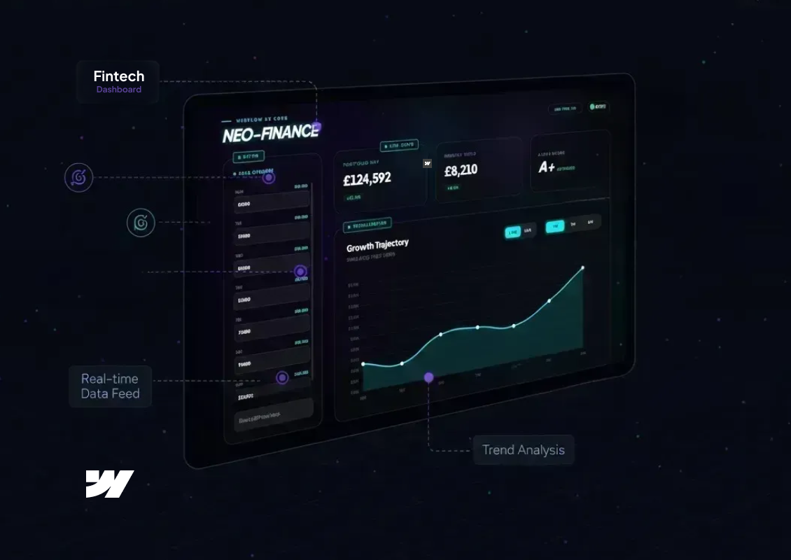
Period Adjustments
Auto-syncing to GBP visualizer
Ready
FINANCE ENGINE v2.9
NEO-FINANCE
Live
Live Stats
Portfolio NAV
£124,592
+12.4%24H
Monthly Yield
£8,210
+4.1%Period
Alpha Index
A+
Optimized
Visualization
Growth Trajectory
Simulated Feed (GBP) v2.9
Designing Charts That Communicate Clearly
Financial dashboards are not the place for decorative charts.
Strong principles:
One insight per chart
Clear axes and labels
Consistent colour meaning across the system
Avoid chart types that require explanation
Line charts, bar charts and stacked bars still outperform more complex visualisations when clarity is the goal.
Colour, Contrast and Accessibility
In finance, colour implies meaning.
Common conventions:
Green for positive movement
Red for negative movement
Neutral greys for context
Accessibility matters even more in data-heavy UIs:
Ensure contrast meets WCAG standards
Never rely on colour alone to convey meaning
Use icons or labels alongside colour changes
Trust erodes quickly if users struggle to read numbers.
Real-Time and Perceived Performance
Many financial dashboards rely on live or near-real-time data. Even when data refreshes are delayed, the interface should feel responsive.
Good design patterns include:
Skeleton loaders for charts
Progressive data loading
Clear timestamps showing data freshness
Users care less about perfect immediacy and more about transparency.
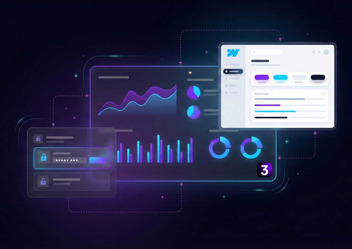
Why Webflow Works for Financial Dashboards
Webflow is increasingly used for financial and data-driven interfaces, especially for client portals and internal tools.
Key advantages:
Pixel-precise control for complex layouts
CMS-driven dashboards for scalable data views
Fast performance and clean front-end output
Easy integration with APIs, automation tools and analytics platforms
With the right structure, Webflow can support sophisticated financial dashboards without sacrificing design quality.
Simple, focused dashboards outperform complex ones almost every time.
Final Thoughts
Designing financial dashboards for the web is about respect for the data and the user. Clarity, hierarchy and trust should guide every design decision. When done well, dashboards become decision engines, not just reporting screens.
Work With 3SIX5 Digital
At 3SIX5 Digital, we design and build high-performance financial dashboards using Webflow for fintech, SaaS and data-driven businesses. From UX strategy to polished UI and scalable systems, we help turn complex financial data into tools people actually enjoy using.
If you are planning a dashboard, client portal or analytics-driven platform, let’s talk.